
Scroll to read the featured post
The Journal

How to Choose Your Brand Color Palette
Choosing a color palette might seem like one of the easier tasks involved in crafting a brand identity. Just throw together your favorite colors and call it a day, right? Well, there’s actually a lot more involved when choosing the right color palette for your brand. Keep reading to learn how to strategically choose your brand color palette that both you and your ideal client will love!
The best color palettes are created with your brand’s target audience in mind.
While it’s tempting to choose colors based on what you personally love, ultimately this approach isn’t benefiting your business. If we start to shift our mindset towards what draws your ideal client in, then we can focus on a more strategic approach when choosing your brand color palette.
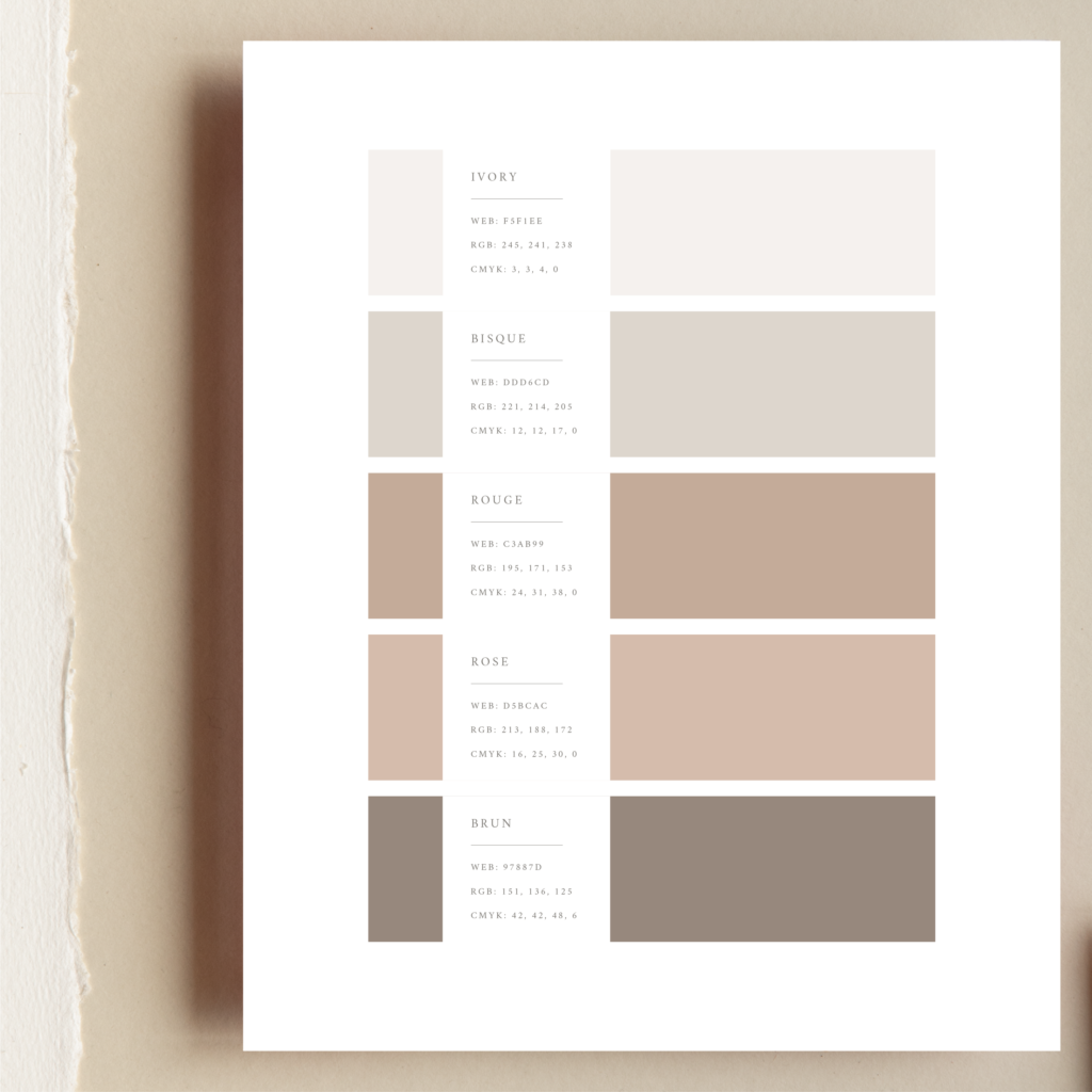
For example, if you’re a wedding photographer who loves working with adventurous outdoorsy couples, then it’s safe to say a bright pink or purple may not be the best fit for your brand color palette. Exploring a more earthy, organic palette that’s reminiscent of colors found in nature could be a more suitable option. Thinking more intentionally will ultimately help attract the types of clients you love working with!
In addition to choosing a palette with your target audience in mind, it’s also important to realize that colors reinforce your brand’s personality and the overall experience you provide your audience through your brand and its visuals.
Colors communicate different feelings and emotions.
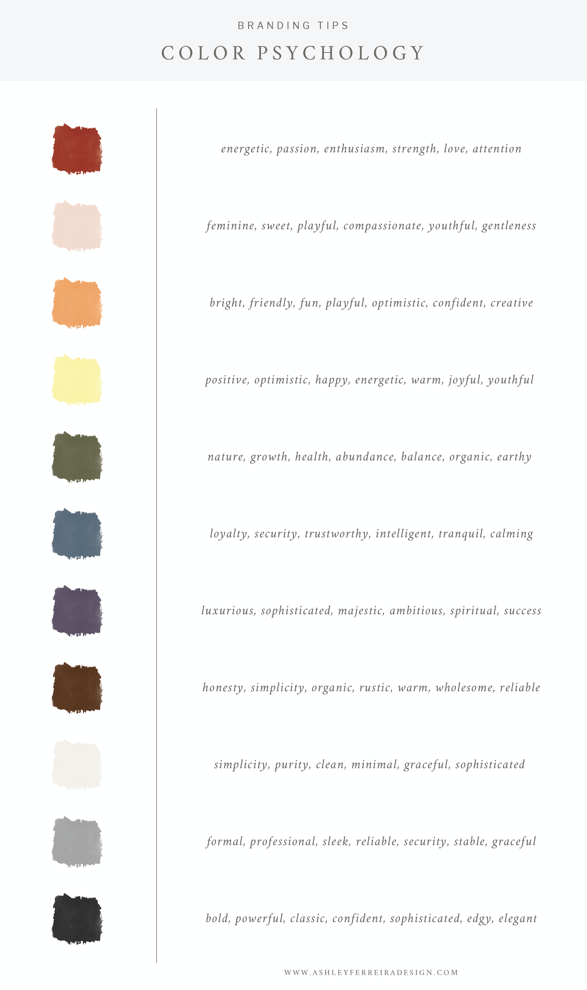
It’s beneficial to have at least a basic understanding of color psychology in order to strategically choose colors that support your business values.
Here’s a quick and simple breakdown of color psychology and the general messaging and meaning behind each color.
After we’ve done the research and have a good idea of which colors would make great choices for our brand, we can then start to formulate a color palette based on color theory. This in turn will help attract the types of clients we want to work with. There are many different ways to do this, but here’s another quick breakdown.
Color Theory
MONOCHROMATIC: Uses variations (lightness and saturation) of a single color. This palette can also incorporate neutral colors such as white, black, or grey.
ANALOGOUS: Uses colors that are next to each other on the color wheel. For example, red, orange, and yellow. It’s similar to a monochromatic palette but has the opportunity to look richer.
COMPLIMENTARY: Complimentary colors that are opposite to each other on the color wheel, for example, red and green. This type of palette can feel energetic and vibrant.

As we can tell, color theory is a complex subject and field of study that professional designers use all throughout the branding process. Although this post only begins to scratch the surface, I hope it’s given you a clearer idea of how you can go about choosing colors more strategically and intentionally for your brand, and ultimately, attract those dream clients!
If you’re thinking you’d rather hand off choosing the perfect color palette to a trained pro, then I’d love to start this conversation with you! Learn how we can elevate your brand through an intentionally chosen color palette (and much more)! by reaching out through our contact form.
")


Get Your Free SEO Guide
Our free Showit SEO guide is here to help you take control of your website's visibility and achieve real results. With instant access, you can start seeing your SEO growth right away.
Free showit seo guide
Unlock Your Website's Potential With Our Free Showit SEO Guide


